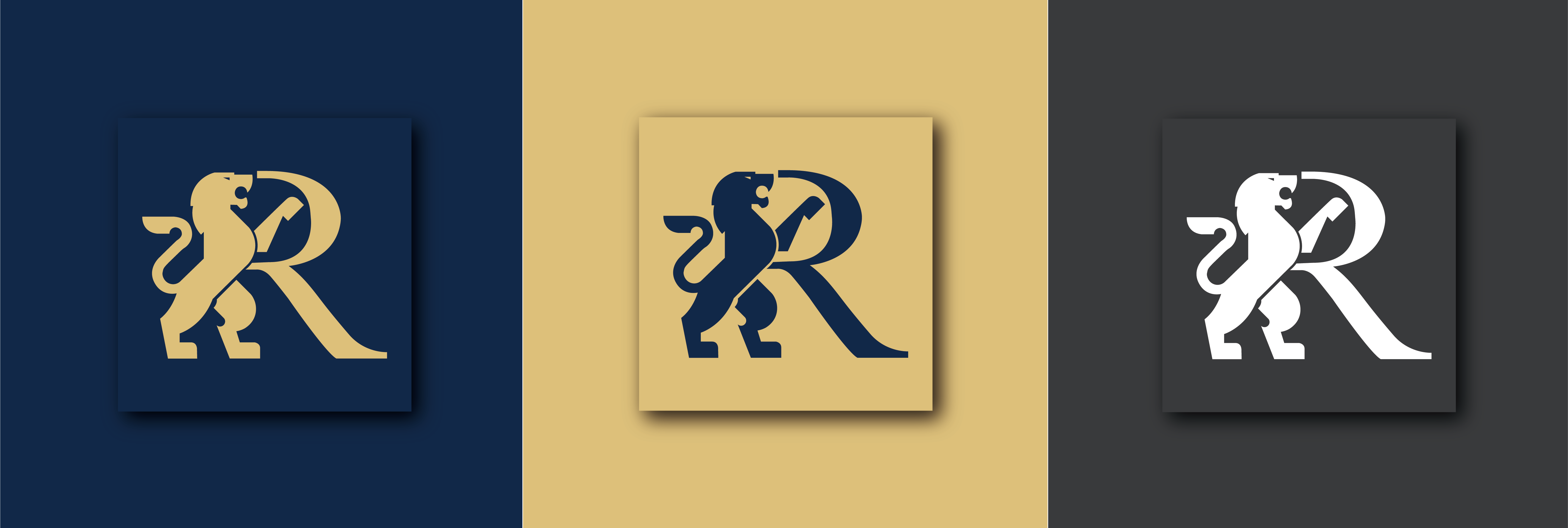
RIDEAU GROUP LOGO DESIGN
ABOUT THE PROJECT
#Branding
The first project in year of OX! A brand new logo designed for my old client. New year, New Start!
RIDEAU GROUP is Chinese real estate agents of ROYAL LePage Real Estate. Their main business is Effective marketing strategy on both English and Chinese channels, to maximize exposure to buyers resulting in sold for the best possible price.
Tool
Adobe Illustation, Adobe Photoshop
Client
ROYAL LePage Real Estate Agents
Date
2021/January/12th
ABOUT LOGO
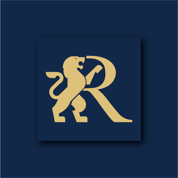
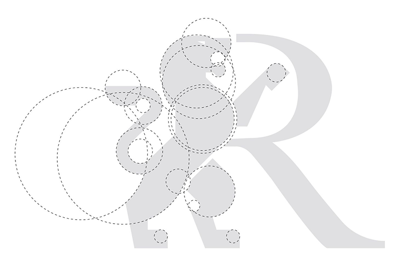
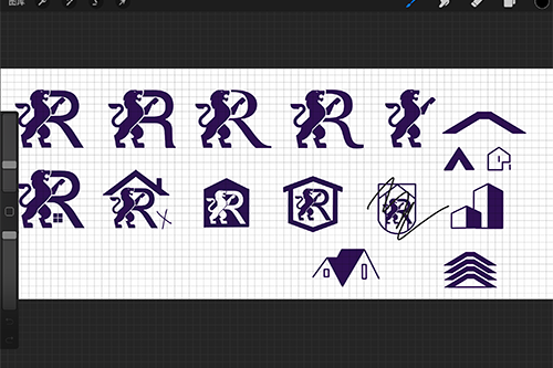
The left side of the logo features a royal lion as the main element. The image of the lion represents authority, professionalism, and strength, highlighting the professionalism of the team. On the right side of the logo is the letter R, taken from the initials of the team name and occupation.
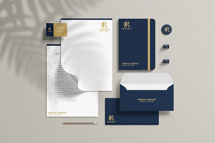
The logo uses gold and blue as the main colors, which adds a sense of business to the team. According to customer requirements, I designed three different types of logos to adapt to different use environments.
